
Visual Hierarchy
FamilySearch
familysearch.org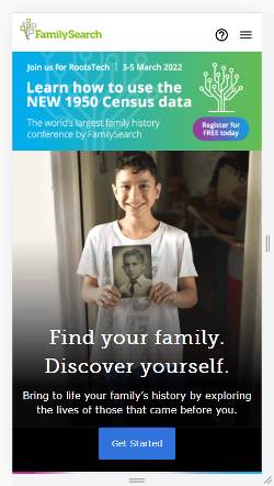
FamilySearch uses the design principle of visual hierarchy to guide you through their site. Your eyes are first drawn to the smiling boy holding the portrait. From their your eyes fall onto the portrait. The portrait then in turn leads you to the largest headline on their web page about finding you and your family. Your eyes then naturally fall to the subtext for that title and then finally land on the "Get Started" button. After that your eyes travel to the headline at the top of the page. Then the color and size of the FamilySearch logo catches your attention. From their your eyes are drawn to the register button under the tree. Then your eyes travel to the help and menu buttons. Finally, your eyes go to the subtext surrounding the top heading. FamilySearch's site skillfully uses pictures, text sizes, location of items, and colors to lead you through their web page.
White Space and Clean Design
Red Robin
redrobin.com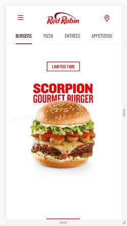
This screenshot demonstrates an excellent use of white space to give the web site a clean looking design. The first thing that really jumps out at you on this page is the hamburger. This is because there is so much white space around the hamburger. Next, the Red Robin logo at the top grabs your attention along with the menu and find location buttons. The buttons are evenly spaced and have plenty of white space surrounding them. Their red color and all their surrounding white space, really help them to stand out. Finally, the different food category buttons are placed below that in an orderly, straight and evenly spaced line with appropriate white space between them to make them easy to access. The more I look at this page, the more I want to click a button and order some food. This is positive proof that Red Robin's approach and use of white space on their site is extremely effective.
Repetition
Target
target.com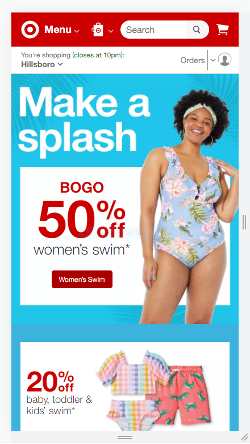
Target's website is an excellent example of the design principle of repetition. In Target's web page the color red is repeated throughout the site. You find it in the Target logo, in the header, in the references to savings, and in the call-to-action button. Their use of the color red to make an association with their company is effective. Red isn't the only repetition they use, in addition the Target logo and the "% off" is repeated twice helping to put emphasis on those things. Then the shaded backdrop of palm tree leaves is repeated three times to help tie their adds into summer wear. The final and most numerous repetition is the drop-down arrows. They are repeated four times, which helps to emphasize their importance. All of these repetitions in such a small space helps to effectively drive home Target's intended messages and bring consistency and order to the web page's presentation.